Friday, July 6, 2012

Project Evaluation.

I have tried my very best to produce work that client will feel relevant to the Bond phenomenon.
I started by planning my narrative story, and on what style I would use for my opening title sequence, in this case I decided to go for a silhouette style, similar to the mad men opening.
Due to choosing this style I learnt how to create silhouettes by using vector images.
I had difficulties with keep track of time during this project, the majority of my time was taken up by  the actual creation of my A1 storyboard. I also had trouble with getting the photos that I would have liked, this was because I was the Bond model for the photos and I had to use photos that my other class mates had taken.
I would have liked to work more directly with the client. Doing this would help because then the client would have been able to have given me a better idea of what they wanted to appear in the title sequence, they would have also been able to ask me to change my design if they didn’t agree with something that I put in.
The shape and form created by my piece was inspired by Daniel Kleinman’s Casino Royale opening and the title sequence for Mad Men. I also like the Casino Royale title sequence’s way of continuing the story of the film during it’s running time.
Unfortunately  due to my earlier stated problem with the availability of photos it meant that I couldn’t follow my Narrative Story completely, so I decided to stick with the chasing of the villain but leave out the changing of vehicles and I also didn’t have a fight scene, also the gender of the villain was changed due to the limitations of the photo’s available.
I really did enjoy this project as it was working on a film series that I have enjoyed since I was a child and it allowed me to let my imagination run wild, however I felt that I still need to improve on my time management as I spent to much time working on one area when I should have been working on something that took time and was more important.

Storyboards

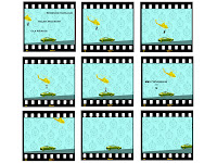
I created some experimental storyboards for the title sequence.


Thursday, July 5, 2012

Different Style of Typography Art

Logo Character Design - This type of typography art would be used by a company perhaps looking for a company mascot, or it could be used by a company that's main target audience is children as a character made from a logo could really appeal to younger aduiences.

Image Replacement - This type of typography art is where you basically use words or phrases to create an image a lot of the time the text is coloured and are different sizes. I like this tupe of art coz it gives you a lot to look at whether it's the text or the the image itself.


Combination of Text and Photography - This is as the name suggest, a combination of typography amd something else, in this case a photograph. This type of art almost has a illusion type look to them.


Abstract shapes and letters - This is were shapes and letters have been altered in order to create a image that is different from the letter itself, on the other hand the final image may still resemble the original shape(s) and/or letter(s).

Typography Silhouette - This is where you use text to create the basic shapes of either someone or something and you only use the prominant colour for the each part of the subject and there is very little facial details.


Tuesday, July 3, 2012

Types of Storyboards

Film Style

As you can see with a film storyboard everything has been sketched roughly, this is most likely because they are only really used as guidelines for  the director to follow when directing a scene.

Graphic Novel Style

Graphic Novel storybording is different to the film story board as it is dawn in pencil first then inked by the either someone else or the same person, graphic novels are also most of the time in black and white, somtimes grey too, also with graphic novels the book is itself just one large storyboard, which is why it has so much more detail involved.

Comic Book Style
With a comic book it is similar to the graphic novel, but with comics they are pretty much always in colour and usually have a consistant number of frames on each page, usually 6-12 frames, they also emphasize sound effects and speech.

Comupter Game Style
In storyboards for computer games the emphasis seems to be more on the characters rather than the background, this is probably because the 3D graphic designers will be working on what the characters are doing instead of what the backgrounds look like, usualy the backgrounds are design as art concepts instead of storyboards.

Fashion Style
Storyboards for fashion shoots are very rough sketches with colour added too, this is because these storyboards, like the film storyboards, are really only created a  guideline for the photographer.

Graphics/Photographic/Tablet Style
In this story board, the frames are made by computer graphics and photography, but it is more or less similar to the film storyboard as it helps the director know what he looking to end up with.

Tuesday, June 26, 2012

Raymond Pettibon

Raymond Pettibon is an American artist who lives and works in Venice Beach.

Pettibon is known for his comic-like drawings with disturbing, ambiguous and/or ironic text that usually appear on his drawings.
Pettibon originally used indian ink, and his work was pretty much always black and white, but he then latter used watercolours, pencil, collage and other mediums meaning that more colour was added to his works.
Pettibon has also created animations with his works as well as just drawings, for example the music video for the Red Hot Chili Peppers song 'Monarchy of Roses' uses animated Pettibon styled images throughout the song along with the typical text that comes along with his work.

I feel that Pettibons work is very grim and confusing at times which leaves me feeling quite uneasy about his work.


Dominic McGill


Dominic McGillDominic McGill is an English artist/graphic designer who is currently living in America.

McGill is known for his work with typography, using it in most of his art, using as a sort of pattern for his work, he has created many pieces of 3D art which is covered in typography.

Because he uses typography on his work, his works aren't really that colourful mostly just black and white, however because of how he uses type of different sizes and shape and inverting between black and white, it makes his work look almost like a willow pattern dish.

I wouldn't say that I like McGill's work, but more that I find it interesting as he uses abnormal shapes and it would take a while to read everything that is on his work.
He Results As Cause Of Himself (detail)
MolochMuqaddimah (detail)

James Bond Typography Art


This is a piece of work that I created that was inspired by other people who have used typography to create art. I decided to use the Film Titles, quotes and the actors who have played Bond to create this piece.