Tuesday, June 26, 2012

Raymond Pettibon

Raymond Pettibon is an American artist who lives and works in Venice Beach.

Pettibon is known for his comic-like drawings with disturbing, ambiguous and/or ironic text that usually appear on his drawings.
Pettibon originally used indian ink, and his work was pretty much always black and white, but he then latter used watercolours, pencil, collage and other mediums meaning that more colour was added to his works.
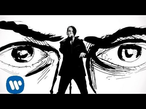
Pettibon has also created animations with his works as well as just drawings, for example the music video for the Red Hot Chili Peppers song 'Monarchy of Roses' uses animated Pettibon styled images throughout the song along with the typical text that comes along with his work.

I feel that Pettibons work is very grim and confusing at times which leaves me feeling quite uneasy about his work.


Dominic McGill


Dominic McGillDominic McGill is an English artist/graphic designer who is currently living in America.

McGill is known for his work with typography, using it in most of his art, using as a sort of pattern for his work, he has created many pieces of 3D art which is covered in typography.

Because he uses typography on his work, his works aren't really that colourful mostly just black and white, however because of how he uses type of different sizes and shape and inverting between black and white, it makes his work look almost like a willow pattern dish.

I wouldn't say that I like McGill's work, but more that I find it interesting as he uses abnormal shapes and it would take a while to read everything that is on his work.
He Results As Cause Of Himself (detail)
MolochMuqaddimah (detail)

James Bond Typography Art


This is a piece of work that I created that was inspired by other people who have used typography to create art. I decided to use the Film Titles, quotes and the actors who have played Bond to create this piece.

Daniel Klienman

Daniel Kleinman is a British television commercial and music video director who designed the title sequence for the James Bond series of films from 1995 until he was replaced by MK12 in 2008.


In the majority of the Bond films that Kleinman designed (with the exeption of Casino Royale) he has informed the viewer of what the storyline of the film will be about via the use of how the women are portrayed in the sequence, for example in the Goldeneye opening, he has women tearing down communist icons implying that the film is set not long after the fall of communism.


In Die Another Day, Kleinman brought back the using of the title sequence to further the story (something not done since the opening of Dr. No) this also continued in the opening of Casino Royale (although Casino Royale's opening the use of naked women is absent).


I'd have to say that my primary reason for liking Kleinman's work is that I grew up watching the Bond films that he had designed the titles for, also my fovourite Bond film is Goldeneye which was the first bond film that he designed for.

Robert Brown John

Robert Brownjohn is a graphic designer from America who is known for blending formal graphic design concepts with wit and sixties pop culture, he is best known for his movie title sequences the opening title sequences for the James Bond films, 'From Russia With Love' and 'Goldfinger'

In the two title sequences that Brownjohn created for James Bond consisted of typography and film shots 'projected' onto a naked/half naked female body, this was more than likely to represent the way that women are portrayed in bond films and to go with what has been a running theme with pretty much all of the opening titles of James Bond films.

I like Brownjohn's works as they are something different from other film openings and are a very imaginative ideas.


Narative Code


Roland Barthes developed a concept that every narrative is interwoven with five codes that drive one to maintain interest in a story. The first two codes involve ways of creating suspense in narrative, the first by unanswered questions, the second by anticipation of an action's resolution. These two codes are essentially connected to the temporal order of the narrative.
The Hermeneutic Code
The hermeneutic code refers to plot elements of a story that are not explained. They exist as enigmas that the reader wishes to be resolved. A detective story, for example, is a narrative that operates primarily by the hermeneutic code. A crime is exposed or postulated and the rest of the narrative is devoted to answering questions raised by the initial event.
The Proairetic Code
The proairetic code refers to plot events that imply further narrative action. For example, a story character confronts an adversary and the reader wonders what the resolution of this action will be. Suspense is created by action rather than by a reader's wish to have mysteries explained. The final three codes are related to how the reader comprehends and interprets the narrative discourse.
The Semic Code
A seme is a unit of meaning or a sign that express cultural stereotypes. These signs allow the author to describe characters, settings and events. The semic code focuses upon information that the narration provides in order to suggest abstract concepts. Any element in a narrative can suggest a particular, often additional, meaning by way of connotation through a correlation found in the narrative. The semic code allows the text to 'show' instead of 'tell' by describing material things.
The Symbolic Code
The symbolic code refers to a structural juxtaposition that organizes meanings by way of antitheses, binary oppositions or sexual and psychological conflicts. These oppositions can be expressed through action, character and setting.

The Cultural Code
The cultural code designates any element in a narrative that refers to common bodies of knowledge such as historical, mythological or scientific. The cultural codes point to knowledge about the way the world works as shared by a community or culture.

Monday, June 25, 2012

Gordon Douglas Ball

“To some extent I realized that the journey toward making a work of art was as important as the work of art itself. I’ve always made my photographs autobiographical. I like the idea that my photographs are poetry, in the way a poem is not a statement but a summary of feelings that somehow cohere into a meaning which can only be felt, rather than spoken. These photographs will tell you what I cannot say in words. I have always been attracted to the themes of romance, chaos, alienation and mainly reestablishing a sense of identity. I want to emphasize the beauty of those themes, and if my work is rooted with abstract ideas, then so be it”.
Gordon Douglas Ball
New York City            

2011

Gordon Douglas Ball is both a visionary and a rebel, whose interests center on an internal rather than an external reality. On the flat surface of the photographic plane, Gordon Douglas juxtaposes near and far, light and dark, large and small. His clear and sophisticated manipulation of light follows none of the established conventions of photography. - http://www.gordondouglasball.com/index.php?/statement/statement/


Some of Gordon Ball's photography looks very urban art like in the fact that they look like walls that have had paint splashed on them, and in turn they look very graffiti like. Most of Gordon Ball's photography consist of vibrant colours and most of the time show the whole range of the colour spectrum.

I like Gordon Ball's work as they are simple ideas that have a great look to them and they would easily catch the eye of anyone passing by.